

UI kit
The Knolyx design system
Colors, type, buttons and components used across knolyx.com. Colors come straight from the Knolyx logo; layout follows the Sun Bloom Tech site system.
Short answer
01 · Color palette
Three logo colors, plus neutrals
02 · Type
Plus Jakarta Sans for everything, IBM Plex Mono for labels
Eyebrow · IBM Plex Mono 12 / uppercase
Heading 1 · accent
Heading 2 · section titles
Heading 3 · card titles
Lede · 19px muted. Knolyx combines gamification, real-life scenarios and hybrid learning.
Body · 16px / 1.6. Running text stays near 65 characters wide so it reads comfortably on every screen.
- Tick list item
- Second tick list item
03 · Buttons
Pill buttons in three styles
04 · Chips and states
Status in form, not only in color
LiveComing soonNeutralYesLimitedNo
05 · Components
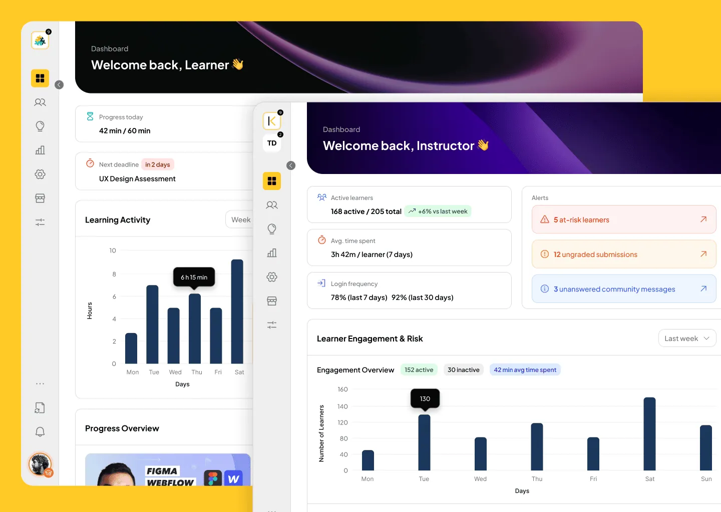
Product window, feature list, quote
- Feature list itemIcon, bold title and a muted description
- Second itemRows are separated by hairlines
FAQ